Furniture color palettes: How can they transform your space?
- Modern color combinations can transform living spaces by influencing mood and perception.
- Popular pairings:
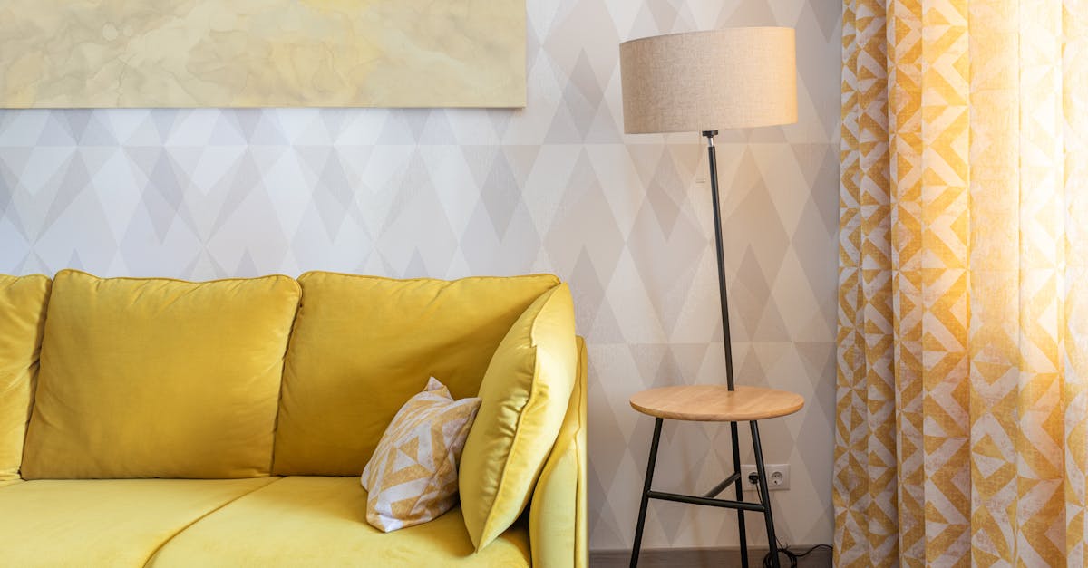
- White and yellow for energy
- Pink and gray for calmness
- Brown and blue for classic versatility
- Black, gray, and yellow for sophistication
- Black and white for timeless style
- Light colors make rooms feel larger, dark colors create coziness.
- Modern combinations are trendy due to their ability to express personal style and enhance spaces.
- Consider room size, function, and lighting when choosing furniture colors; experiment with color threads for cohesive decor.
- Color psychology in furniture design affects emotional well-being; colors like blue induce calmness, while yellow boosts creativity.
- 2023 color trends include vibrant yellow, soothing pink and gray, and classic brown and blue.
- Use color coordination to achieve cohesive interior design, focusing on main themes and balancing bold choices.
Color has the power to change everything. In your home, it sets the mood, serves as an expression of creativity, and even impacts the perception of space. When it comes to furniture, modern color combinations can truly transform your living space. Whether you're revamping a single room or coordinating an entire home, understanding how color palettes affect ambiance and mood is crucial. Let's dive into how thoughtfully chosen hues can elevate your space to new heights!
How Can Modern Color Combinations Transform Your Living Space?
Color can change the way we feel. In our homes, colors can impact how we see our furniture and space. Let's talk about some striking modern color combinations and how they can transform your living area.
What are some striking modern color combinations for furniture?
There are many combinations out there, but a few stand out. White paired with a sunny yellow can uplift any room. This pairing brings fresh energy and creates a cheerful vibe. If you're looking for something more soothing, try pink and gray. This duo offers a calm ambiance, perfect for relaxing evenings.
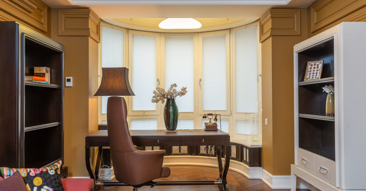
For those who love timeless styles, brown and blue never fail. Brown adds warmth while blue keeps things calm. This pair can fit into both classic and modern rooms.
Let's not forget about black, gray, and yellow. This elegant mix creates a chic look, balancing sophistication with a splash of fun. Meanwhile, white with beige adds softness, preventing rooms from looking too stark or clinical.
Bold choices exist, too! Pink and mustard yellow can offer a playful yet serene atmosphere. They work well together to bring joy and harmony.
How do different shades affect the perception of a room's ambiance?
Shades play a big role in how we perceive a room. Light colors tend to make spaces feel larger and more open. Darker colors, however, can create a cozy, intimate feel.
If you pair blue and coral, you can create a lively mix. These colors balance each other well, with coral adding warmth to the calming blue tones.
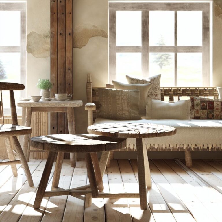
Earthy tones, like brown mixed with cream, can lighten up a room. They bring out a room's rich character and cozy down-to-earth feel.
In contrast, blue and white can give off a clean, coastal vibe. This classic combination feels fresh and inviting, even if you're far from the ocean.
Why are modern color combinations increasingly popular in interior design?
Modern color combinations gain popularity because they bring out personality and style in homes. They allow for creative freedom and personal expression. People love them for their ability to transform spaces and bring everything to life.
Take black and white, for instance. It's a timeless choice that never goes out of style. Everyone knows this pairing blends elegance with simplicity.
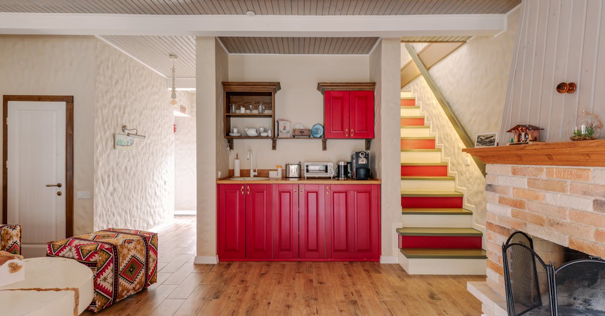
Some opt for primary colors like yellow, green, and red. This mix creates a vibrant and lively environment, perfect for a room full of energy.
Gray and white, on the other hand, keep things calming. This combination allows focus on shapes and patterns, making unique elements stand out.
Lastly, for those who crave boldness, pale red with olive green makes a statement. It offers a unique look that stands out from the crowd.
In a nutshell, color influences how you experience your home. Whether you want a calm retreat, a lively gathering spot, or a classic look, modern color combinations can transform your space into what you wish. Check out some tips on color schemes for more ideas to inspire your transformation journey.
What Are the Best Practices for Choosing Furniture Colors?
Selecting the perfect color for your furniture can refine your room's personality. How can you select the right color to match existing decor? To match your current decor, begin by noting your room's colors—walls, floors, and accents. Focus on hues already present; for example, if you have a blue rug, consider chairs in a similar or complimentary tone. This harmony creates flow and balance in your space.
Which factors should be considered when choosing furniture colors? First, think about the size of your room. Light colors like white or beige can make small spaces feel larger. Conversely, dark shades like navy or charcoal can add coziness to vast rooms. Next, consider the room's function. A restful blue or green suits a bedroom, while energizing hues like yellow or red may spark up a living room. Also, remember the natural light—colors can appear different in bright sunlight versus dim interiors. Examine swatches at different times of day for a true evaluation.
Home is where comfort meets style. Selecting furniture colors is a blend of both. Consider your lifestyle: if you have kids or pets, fabrics in darker, easy-to-clean colors might be best. The durability of certain colors can save you time and stress in maintenance. Also, factor in your personal style—do you lean toward timeless classics or love bold, modern statements?
What are some expert tips for harmonizing colors across different rooms? One effective strategy is creating a color thread to lead from room to room. Choose a base color that appears in each space, but vary the secondary colors. For instance, let a soft gray wall connect living areas, with pops of teal in the living room and splashes of pink in the bedroom. This approach links spaces while allowing each room to express its own character.
An expert tip is to explore color wheel relationships. For a harmonious look, consider analogous colors—those that sit side by side on the color wheel, like green and blue. Alternatively, complementary colors, like orange and blue, can add vibrant contrast. Don't shy away from mixing patterns and textures within these colors for added depth and style.
White and yellow is a vibrant combination, demonstrated beautifully by Ghislaine Viñas with cheerful yellow armchairs. This duo can introduce energy and warmth into a space. Meanwhile, pink and gray create a soothing ambience, especially with focal points like Liberty Interiors' geometric paintings. Brown and blue offer classic versatility, well-suited for any decor style, as seen with Becca Interiors' blue walls paired with brown leather.
I often explore Interior Define for versatile and stylish options that fit diverse palettes. Or consider exploring The Inside for unique designs to suit various tastes. These resources provide inspiration and selections that can elevate your home decor game.
Remember, choosing the right furniture colors transforms more than a room; it impacts mood and function. Thriving spaces find balance in style and comfort, adjusting for light, size, and purpose. By using expert tips, colors can sing in harmony, allowing each room to shine its brightest.
How Do Color Psychology and Furniture Design Intersect?
Colors can change how we feel and how we see spaces around us. This is where the magic of color psychology comes into play in furniture design. Understanding how colors affect us can help make a room feel more welcoming or calm or even exciting. Let’s dive into how choosing the right colors for your furniture can really transform your living environment.
How do different colors influence mood and interior space?
Colors play a big role in shaping how we feel in a room. For example, blue is well-loved because it feels calming and relaxed. It is a great choice for bedrooms or areas where you want to relax. Yellow, on the other hand, is bright and happy, making it perfect for kitchens or playrooms where energy and creativity are welcome. Red can bring warmth and excitement to a space but can feel too strong if overused. Each color has its own vibe and can make a space feel very different.
What role does color psychology play in furniture design?
Color psychology helps us know how colors make us feel. With this, designers select colors that fit the room’s purpose. Designers use this knowledge to evoke certain emotions and set moods within a space. For example, if a space is meant to bring people together, like a living room, warm tones such as brown or earthy colors can create an inviting atmosphere. On the flip side, cool colors like green and light blue promote calm and peace, perfect for tranquil spots like a library or reading nook.
Designers deeply consider how colors make us feel when they choose them for furniture. They aim to enhance the space’s function and feel. Using principles from color psychology ensures that each piece supports the room’s purpose while adding to its beauty.
How can color choices enhance emotional well-being in living spaces?
Choosing the right colors can make us feel better emotionally. It is amazing how simply picking the right shade can influence your mood positively. For example, in spaces used for relaxation like living rooms or bedrooms, using mood-enhancing colors can make a huge difference. Think about a soft green chair that offers peace or a cozy brown couch that exudes warmth.
In spaces where energy is needed, vibrant colors like orange or bold red can boost mood and inspire action. The secret is to blend and balance these colors with more neutral tones, ensuring that the space doesn’t feel too chaotic.
Designers also use color to tie different parts of a home together, making them look unified and balanced. When every room reflects similar themes through its colors, your home feels more complete and thought-out. This harmony in color choice is not only pleasing to the eyes but also soothing to the mind.
In conclusion, color psychology helps us understand how colors make us feel and how they can impact our well-being. By choosing the right colors in furniture design, we can create spaces that not only look amazing but also make us feel incredible!
Which Color Palettes are Trending in Furniture Design for 2023?
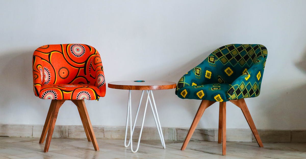
Color choices can shape a room’s entire feel, setting the mood with every hue. In 2023, furniture designers are focusing on trends that elevate spaces. Let me walk you through what's captivating this year.
Vibrant Yellow and White: Designers are turning to white and yellow to bring energy into homes. Picture bright yellow armchairs in a white-walled room. They don't just pop but infuse warmth and cheerfulness. Ghislaine Viñas transformed a SoHo loft with this combination, giving it a bright, happy twist.
Pink and Gray Soothing Mix: If you want something calming, pink paired with gray offers tranquility. It’s a soothing palette that pleases many guests. At Liberty Interiors, such combinations draw eyes to focal points like geometric paintings. It’s a touch of art meeting comfort.
Classic Brown and Blue: The marriage of brown and blue remains timeless. It's perfect for spaces that balance the old and new, be it modern or classic styles. Blue-painted walls with brown leather sofas, as Becca Interiors demonstrates, are the epitome of this harmony.
Sophisticated Black, Gray, and Yellow: This trio indulges your taste for something elegant. Imagine matte black walls with soft gray sofas, highlighted by yellow accents. It’s a chic look perfected by Caroline Andreoni Interior Design, promoting a dynamic yet classy feel.
Warm All-White and Beige: Not a sterile white, but a tender blend of whites and beiges, offers coziness. Leanne Ford Interiors showed it beautifully in a 1920s Los Angeles cabin, creating a nurturing and inviting living space.
Versatile Pink and Mustard Yellow: Pink and mustard yellow work together to make spaces plush yet lively. Fantastic Frank shows this pairing can craft a serene atmosphere, where color adds gentle sophistication.
Blue and Coral: When these two come together, they brighten spaces with wood tones. Atelier Davis showcases a setting with a smooth wood accent wall that frames this vibrant duo.
Rich Earth Tones: Brown woven with cream brings light to rooms, enhancing their natural character. Tyler Karu expanded this look in a Spanish Colonial living room, proving it's both earthy and refined.
Blue and White Coastal Charm: You don't need to live by the sea to enjoy this fresh combo. Blue and white offer the same coastal vibe indoors, just as Allison Babcock Design illustrates with Nantucket’s shiplap rooms.
Black and White Elegance: This color pairing withstands time, creating classy spaces. Louis Duncan-He Designs used it to unite a living room with curated vinyl collections.
Primary Colors Spark: Bright yellows, greens, and reds inject vibrancy into traditional spaces. Studio Peake employed this engaging scheme in a British living room, delivering a joyful outburst.
Calm Gray and White: Grays paired with whites are soothing yet sophisticated. Michelle Gerson Interiors made shapes and patterns the primary interest, perfectly balancing calm color tones.
Bold Pale Red and Olive Green: This is a daring duo. With visual assertiveness, Jessica Davis’ spaces use this palette to leave lasting impressions.
Charcoal and Green Nature: Matte charcoal walls heightened with green elements create a natural look. Laquita Tate presents this combination as a backdrop that flourishes with decor and plants.
Beige and Sand Serenity: Matching colors with the outdoors, such as beige and sand, blends spaces with nature. Laura Brophy Interiors perfected this in a midcentury desert living room.
Sophisticated Black with Gold: Black combined with gilded accents makes for a chic, polished appeal. Leanne Ford enhances the sleekness of modern homes with these dark, luxuriant contrasts.
Colorful Trios: Picture schemes like blue, green, and orange; they just zing with modern taste. Fantastic Frank gives an example in a midcentury apartment where these colors lift the energy.
Blush and Navy Duality: This combination is easy to style, creating space that highlights colorful art. Tyler Karu's interiors show how white walls can act as a canvas for this perfect harmony.
Warm Black and Cognac: Alvin Wayne's NYC apartment illustrates warmth with black and honey-toned wood. It's a clever mix that offers an inviting, modern feel.
Subtle Mix of Five: Mixing white, gray, blue, brown, and rust into spaces brings quiet complexity. Cathie Hong Interiors makes the case with their detailed and airy designs.
Moody Ombre Blues: These paired with pale grays foster a gentle, artistic atmosphere, as proven by Tina Ramchandani Creative’s profound use of ombre effects.
Terracotta with Pale Yellow: Above white backdrops, these colorful accents lend warmth and subtle flair, as Cathie Hong Interiors can attest with their curated touches.
Bold Royal Blue with Gray: This palette combines bold walls with calm sofas. Forbes + Masters make it clear how glossy blues can harmonize with soft gray in stunning ways.
Refreshing Turquoise and Gold: They revive neutrals like grays, reflecting nature indoors. This style shines in Michelle Boudreau's Palm Springs designs, where midcentury touches abound.
As you decide on a color palette, think about what vibe you want. Your choice could echo simplicity or embrace complexity, making all the difference.
How to Use Color Coordination for a Cohesive Interior Design?
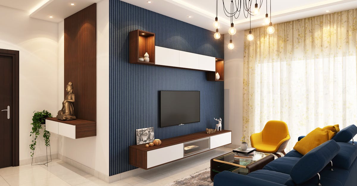
Color coordination is key to a successful living room design. The first step is to choose a main color that will lead your theme. Start with what you like or what makes you feel good. This main color should be used in larger items like sofas or rugs. Look around your room. Pick one color from a favorite piece of decor and play it up. This is a sure way to ensure that everything clicks together.
Mix and match two or three colors that complement each other. Use a color wheel to find colors with contrast that still look good side by side. Think about the white and yellow mix in a sunny room by Ghislaine Viñas. The main items were kept white, and yellow added bright touches with armchairs to boost mood.
Consider color pairing based on the vibe you want to cultivate. Pink and gray for a soothing setting, or brown and blue for that timeless look. Liberty Interiors used pink and gray with art to highlight geometric shapes. The pink areas draw the eyes, while the gray grounds the room.
Let's coordinate color throughout the whole home. White and beige give a room a soft, cozy feel, seen in a design by Leanne Ford. Here, every piece should share a shade in this soft range. A home might have blue from room to room, with each room using just one other color to complement it. This creates flow from one space to another.
Now, what should we not do? Don’t overdo contrasting colors. High contrast can energize but may overwhelm when used too much. Balance is crucial. Use black sparingly unless it's tied in with key design features. Caroline Andreoni’s work with black, gray, and yellow shows the power of balance. Use matte black on walls for drama, but keep most pieces gray or yellow.
Bold and unexpected doesn't have to mean chaos. Primary colors like yellow, green, and red can all shine without clashing. Let these colors guide smaller accents like pillows or artwork. Studio Peake’s British room does so by using these colors sparingly but effectively.
Finally, take advice from professionals. Jessica Davis of Atelier Davis encourages using two bold colors like pale red and olive green for a strong style. This pairing offers visual delight in every corner, yet remains in harmony by tying to shared textures or finishes.
In essence, color coordination should be a fun dance of ideas. Bring in what speaks most to you. Use tricks like shared undertones to link different rooms. Check that colors talk to each other; none should stand alone without purpose. With these steps, your home can transform into a true reflection of your taste and feel wholly connected.
Conclusion
Modern color combinations can transform living spaces beautifully. Choosing the right colors impacts furniture perception and enhances ambiance. Understanding color psychology and the latest trends helps craft inviting and stylish rooms. Use harmony across spaces and avoid common pitfalls for cohesive design. Remember, the right choices lift moods and create welcoming homes.

